Rebranding Unlumen UI
From shadcn’s default grays to one pink in five months, and from one repository to two.
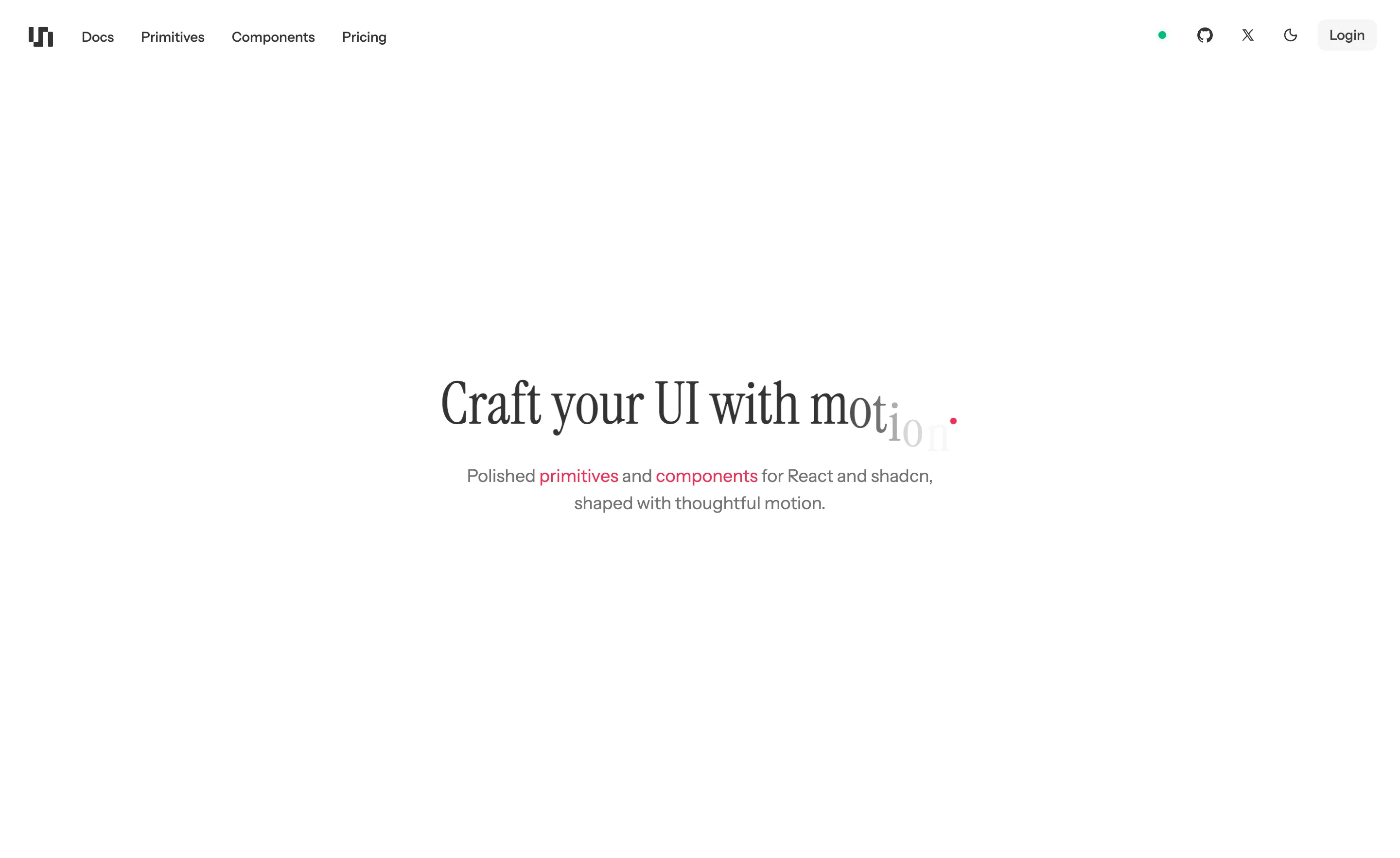
It didn’t happen in one go. The repository has three moments you can point at: the February fork with shadcn’s default tokens, a color redesign merged in March, and a commit called “Refonte” in May, which became 2.0 in July. Here’s the same hero with the actual values from each one.
Craft your UI with motion
Polished primitives and components, shaped with thoughtful motion.
#fffffftext #333333accent #f12e54Refonte: the pink grows up. Instrument Serif, as it is today.
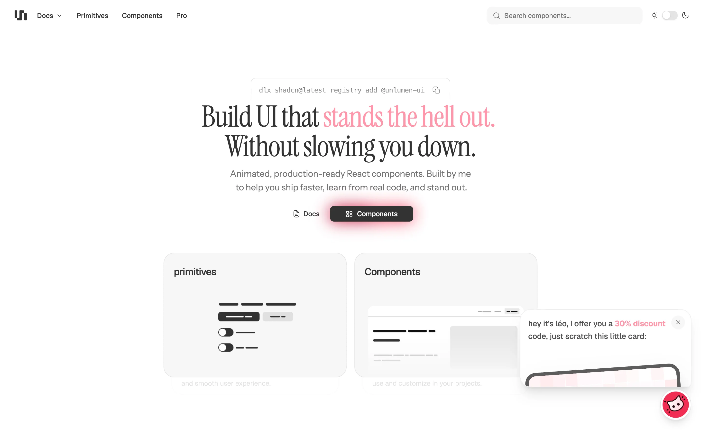
What was wrong before
The home page had a two-color headline, a glowing button, two cards and a discount popup. Making Unlumen made me better at this, and the interface around it stopped being good enough: it wasn’t the minimalism I wanted. For 2.0, the rule became that the interface only moves when it has something to say.
When the time came to redo it, I knew straight away what I wanted, so there’s no pile of rejected logos to show you.
A softer black
The first real decision was to leave pure neutrals behind. The text went to #333333 and the dark mode to #121212. On a page whose job is to show off small movements, a harsh contrast shouts over them.
Type went the same way: Instrument Sans for the text, with a serif for the big titles. Lora came first, and it looked far less minimal than the rest. Instrument Serif replaced it, and it sits naturally next to Instrument Sans, since they’re one family. A library of technical components gets one thing from a serif that a grotesque can’t give it, which is the sense that someone chose it.
One color, used very little
There’s only one accent, and it’s rare enough to mean something: the words you can click in a sentence, the code button in the toolbar, the dot after “mon.” in the Smart Animate Text demo. In March it was a light #ff96a9. In May it became #f12e54, strong enough to be a signal at a very small size.
Two repositories, one library
In July, version 2.0 made Unlumen UI officially open source. Part of it, and I’d rather say that first. The documentation and the public registry are MIT. Pro components, licenses and accounts aren’t, and they live somewhere else. Here’s the same project from both sides.
So there are two repositories, and neither is a mirror of the other. The public one, GitHubunlumen-ui-docs, isn’t a cut-down export: it’s a real app that builds and runs on its own, and it’s what you see at /docs on unlumen UIReact components.
It started with moving out
The split began two months before anyone could see it. The history of the public repository starts on one day in May, and it reads like moving house: get your own place, then decide what’s coming with you.
chore: scaffold standalone public docs app
refactor: organize public registry as primitives
fix: make docs links basepath safe
refactor: flatten and prune public primitives
“Prune” is the honest word in there. Thirty primitives went to the public registry, in one flat folder. A public registry gets read by strangers, so it can’t carry the structure that only made sense to me.
A license isn’t a way in
A license file makes code legal to use. It doesn’t make a project open. So 2.0 came with the rest of it: contribution guidelines, issue and pull request templates, automated checks, dependency updates, a code of conduct and a private way to report a security problem.
Two weeks later, someone I hadn’t asked fixed the tooltip preview for images and favicons. It’s a small fix, and it’s the point of all those files.
Keeping the line where it is
Two repositories only stay two if something checks. The source is validated before the registry is generated and the output after, and whatever gets generated is committed with the change that caused it, so you can read it in the diff.
pnpm registry:validate:sources
pnpm registry:build
pnpm registry:validate:generated
The contributing guide says the rest in a single line: don’t commit credentials, local browser artifacts, commercial Pro source or unrelated formatting.