Rewriting EMFAdmissions as EMFCandidatures
The internal app that turns about 280 applicants a year into apprentices, redesigned from what five years of its database said.
- Role
- Analysis, UX and development
- Since
- August 2026
- Built with
- React, Node.js, Prisma, MySQL
- Status
- Designed, in development
EMFPostulations collects the applications. EMFCandidatures is what happens to them next: checking the file, sorting, internships, Basic Checks (the aptitude test Swiss companies ask apprentices for), evaluations, letters, contracts.
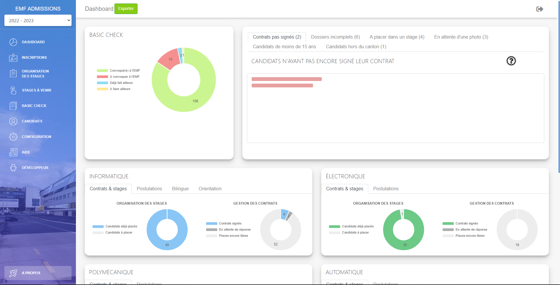
Its predecessor, EMFAdmissions, has done that since 2021: PHP, jQuery, a Bootstrap dashboard theme, deployed by comparing DEV and PROD files by hand. The brief was simple. Keep every feature, change everything else.
What the database said
Before drawing anything, I read the dump. Five years of admissions decided more of the design than any screen did.
- 1389
- candidates
- 2264
- applications
- 5054
- letters generated
- 250
- internships
Many letters share the same second of generation: the secretariat already works in batches, so batches had to be the normal case. There were 383 withdrawals for 382 signed contracts: leaving is as common as signing, so withdrawing can’t be buried in a menu. And third choices are rare, 293 in five years, and fourth choices almost don’t exist: 4. So a file doesn’t need to give them the room of a first choice.
Start from the task
The old dashboard shows seven lists and a wall of charts, all at the same level, all year. But the admission year has phases: prepare, receive, sort, summon, evaluate, decide, contract, close.
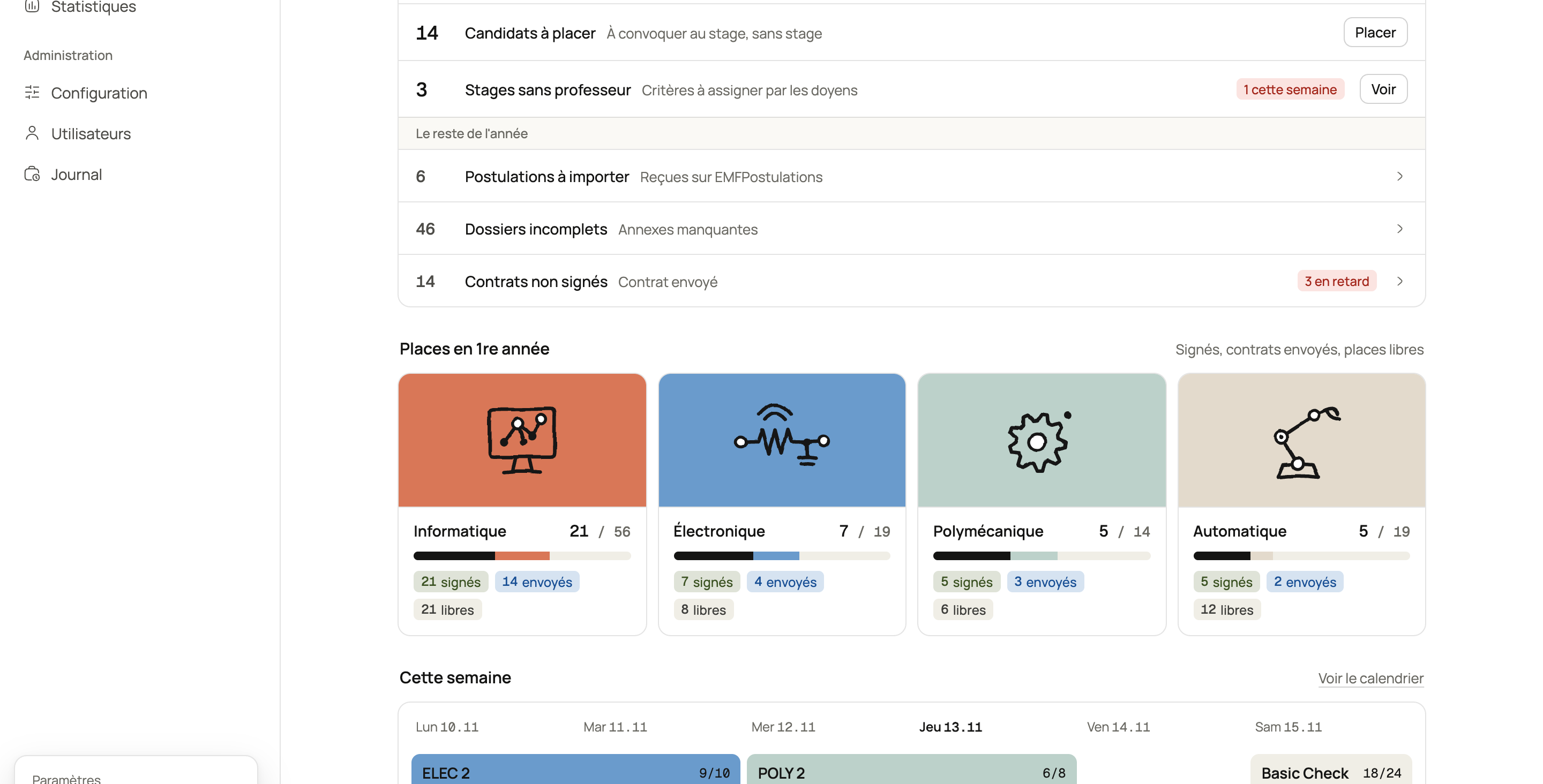
So the overview knows where you are. Its blocks never move, only the to-do list reorders itself, with the current phase on top. Every number is a button that opens that queue, already filtered. Places per trade stay visible everywhere, because filling them is the point of the whole procedure.
One file, three keys
Sorting one file took a dean five clicks and three tabs, for a decision made in a minute. Now it’s a queue: one file at a time, only what the decision needs, three keys. Try it.
1st choice Average 5.0
Already did a programming workshop.
Importing is the most repeated action of the year, about 280 times. You type the file number and press Enter. You tick the annexes that came in, and the state is deduced instead of being chosen: everything there means complete, anything missing means incomplete, with the list of what’s missing. One choice nobody has to make, 280 times.
Application state
Incomplete
Missing: Motivation letter, CV, Basic Check.
Someone who comes twice a year
A professor uses this a few days a year, between two workshops, and doesn’t remember it from one time to the next. So their sidebar has two items, the page opens on the internship in progress, and each grade is one click on a big button. There’s no save button to find.
A calendar, not a table
You couldn’t see how full an internship was without opening it, and placing someone meant a double list with Ctrl+click and arrows. Now each internship is a block on a calendar, in its trade’s color, with its seats. You drag candidates onto it, and the ones that can’t go there gray out while you drag.
The letters follow the states
About a thousand letters go out a year, and nothing showed what was left to send. Now a state that calls for a letter gets a tag, and one page gathers them by type. One batch gives one PDF to print and a ZIP of Word files, because the secretariat keeps its own templates.
Generating a contract also creates the link for the photo and the languages, printed as a QR code. Nobody copies a token by hand anymore.
Twelve tabs, then none
A candidate’s file had twelve tabs and several Save buttons, and an application’s state hid in one of them. It’s now one page of sections. Each application is a card with its progress and the two or three states that logically come next, as buttons. You no longer look for the next state, it’s proposed.
AVS, IBAN and permit are hidden until you click, and that click is logged. Colors never speak alone either: the old orange and red rows became tags that say what they mean, like “3 days late.”
The warm part
A dashboard for hundreds of files can still have a hand in it. Four trades, four drawings, four colors you recognize before reading the name. An empty queue gets a drawing and the date of the next internship, no confetti.
Where it is now
This one is still being built. What you see here is the design, with made-up people, and the build goes in four versions: sign-in and roles, then importing and reading files, then internships and letters, then Basic Checks. Each one has to run on the test system, with its documentation up to date, and be shown in a project review before the next one starts.